We where given an extra part to this project being that we would produce a mail shot to correspond with our posters. The goal was to create something which again used only 2 colours including stock but make it sendable and have ten people to send it to which it would be effective.
My concept stayed the same. I was informing people about the actual failures of the police in response to 999 calls.
I strarted the ideate stage witht he knowledge i had researched from the previous task.
I wanted to make people think about whats going on in the police and try to subtly shatter the image they have of them.
My first idea took the form of a 6ft typical robber vector. I would print it off and fold it up in such a way that the stripey jumper would look like bars showing through the envelope. When the viewer unfolds this large item the criminal would stand there holding a sign saying " There going to be an hour. What shall we do? " ...
 |
| This would be an actual 6ft image. |
The problem i thought up with this idea was that if i sent it to anyone abit too small to hold up something 6ft the actual feel of the piece would be lost. This meant i had to re think my ideas and quite quickly.
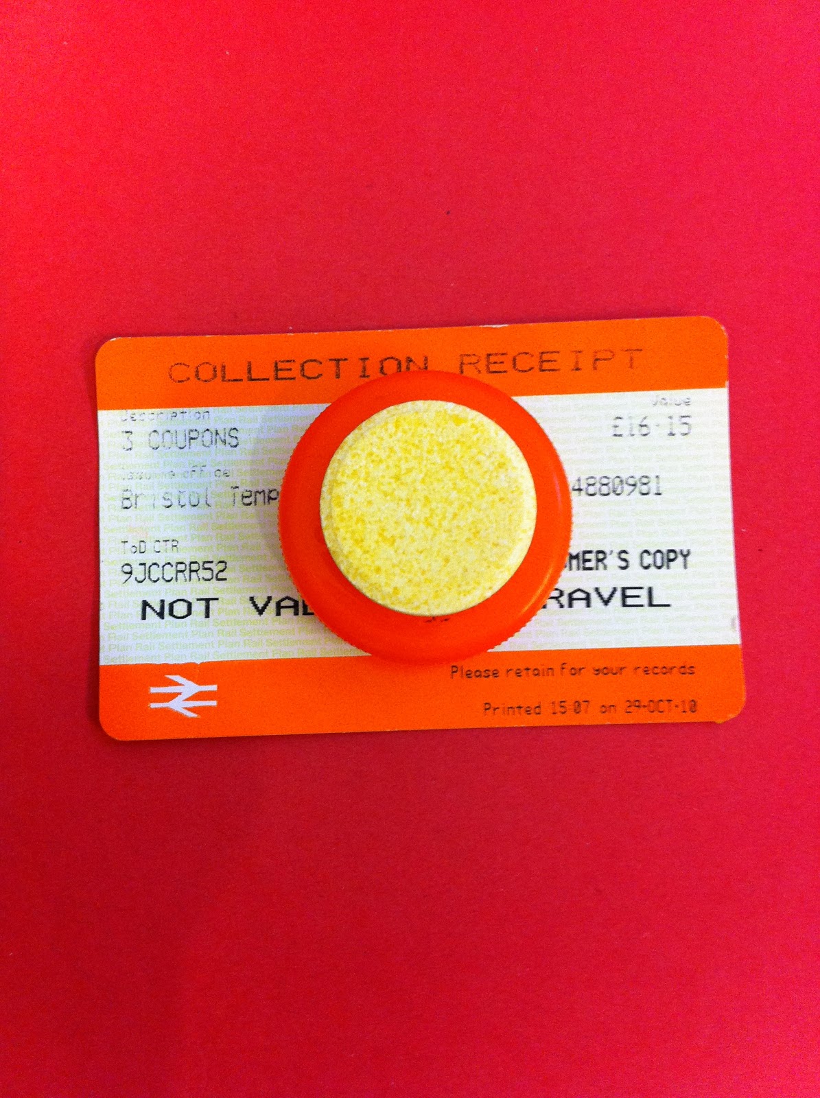
Secondly i thought up of following from my poster and creating something which looked really official.. something which many Leeds people had seen and are used to seeing. Create a Form which would be presented and seen as a parking ticket.
This would mean the anger which people feel from receiving one would pick up before they had even had time to open the letter.
apon opening the form you would notice it says " 999 request form " at the top and then corresponding details to the viewer to be placed below. at the foot of the letter " please allow upto an hour to receive a response to this application".
I felt this would be a really good idea but something i had already created in the past task and wanted something abit more tricky.
Thirdly i decided to create a die cut image of a blood bag. I imagined most people are familiar with the shape and function of a blood bag so if i left the middle section cut away it should still have the same message.
I started with an image of the blood bag and vectorised it. removing the section which contained the blood and replacing it with a sort of greece proof paper looked fantastic. It gave the piece a sense of plastic and made me feel it was achieving the goal whilst still sticking to the brief.
A sticker officially labelled would be placed ontop of the greece proof paper to look like a description to what blood was inside. This would be used to write the address of the receiver onto.
 |
| The red paper would have the information written onto it so as you pull out the item it looks likes the blood is being drained. |
So after presenting these to the group via a crit. It was an obvious vote towards the blood bag idea.
My problem was that i could mix stock. Which made me have to rethink the design. After afew tweaks i came up with having the sticker part of the uncut part of the bag. This worked well but after putting it together i cant help but feel disappointed with the design as it doesn't quite look as professional as i like to set myself.
They look quite dull and im unsure if they really communicate the message.
The back of the red looks like this:
 |
| The typeface is kept the same as the posters to show a link between them both. |
I have grew to think these look nice but i just wish i could produce them with photographic qualities so that they really look something special.
It came to think about who will be receiving this mail shot and why. So i created a quick illustrator document with a list of people who i think would benefit from this.
 |
| 1. Neighbourhood watch HQ |
I decided to include this because if it could be forwarded to areas which they know are not protected by the help of others in their own neighbourhood then it would help push the message.
2. Police HQ
This was an obvious place to forward in my opinion as its a fact that the police need to see and something needs to be done.
3. Mr + Mrs Smith
Through Research These take responsibility for checking up on residential homes and homes of the elderly within a section of Leeds.
4. Leeds City Hall
The city hall has a very used notice board which many people would look at. If this mail shot could be left near or anywhere within the hall people could respond to it and the message would have been delivered.
5. NHS
I thought that this would be a good place to send it too as if any injuries where taken to hospital it would be them whom have to sort it out.
6.Tourist Center
I would send it to here yet i feel it would be better if it was taken in secretly and placed as it would paint a bad image of the police and leave anyone who reads it questioning the professionalism of the Police.
7. Opal One
8. Liberty
9. Sky Plaza
i figured it would be right to send this to the student halls as many students forget that people could easilye nter the building and take or steal things and if confronted they could use violence. So i believe it would be an effective way to try and make people think.
10.Welsh Police Office
I thought i would send one to the Welsh police near the home of the girl who was killed and how this project and story was based upon. I think it would let them know people are still thinking about it.
In conclusion to this:
I havent really enjoyed this side of the project as much as i thought i would have. Alot of my ideas where stopped by limitations stated by the brief. I think i need to start taking in the requirements more before rushing to note down ideas as it leads to things not looking professional or to a standard i would like it too.
My end product i feel has a strong way of communicating the message but was faulted by a bad visual design which wasnt upto scratch.
As mentioned before I feel that if i could have used as many colours as i would have liked the image would have been photorealistic and would have looked alot nicer.